- 关于我的
- macApp
- 工具
- 活动资讯
- 相册
- 编写文章 AI助手
关于我的
macApp
工具
活动资讯
相册
css3样式效果\n\n werwe\n rwerwer\n List item\n\n1.渐进颜色变化\n\n <style>\n /* 渐进色 */\n #linear{\n height:50px;\n width:200px;\n background-image: linear-gradient(to right, rgba(255,0,0,1), rgba...
1.渐进颜色变化

  <style>
   /* 渐进色 */
   #linear{
     height:50px;
     width:200px;
     background-image: linear-gradient(to right, rgba(255,0,0,1), rgba(255,0,0,0));
   }
  </style>
  <div id="linear"></div>
2.按钮进行中状态

  <style>
   /* 按钮 */
   button{
     border: none;
     color: white;
     padding: 15px 32px;
     text-align: center;
     text-decoration: none;
     display: inline-block;
     font-size: 13px;
   }
   #button{
     background-size: 50px 50px;
     background-color: #0ae;
     background-image: linear-gradient(-45deg, rgba(255, 255, 255, .2) 25%, transparent 25%, transparent 50%, rgba(255, 255, 255, .2) 50%, rgba(255, 255, 255, .2) 75%, transparent 75%, transparent);
     animation: myfirst 1s linear infinite;
   }
   @keyframes myfirst
   {
     0% {
      background-position: 0px 0px;
     }
     100% {
      background-position: 0px 50px;
     }
   }
  </style>
  <button id="button">进行中</button>
3.圆360度转动

  <style>
   /* 圆360度转动 */
   #circle{
     border-radius: 50%;
     width:200px;
     height:200px;
     background: linear-gradient(to right,#0ae,red);
     animation: circle 2s linear infinite;
   }
   @keyframes circle
   {
     0% {
      transform: rotate(0deg);
     }
     100% {
      transform: rotate(360deg);
     }
   }
  </style>
  <div id="circle"></div>
4.圆上有线进行上下移动扫描
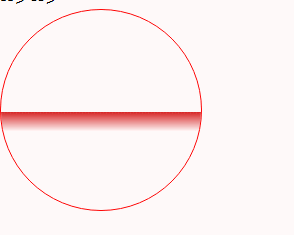
<style>
/* 圆上有线进行上下移动扫描 */
#move{
position: relative;
overflow: hidden;
border: 1px solid red;
border-radius: 50%;
width:200px;
height:200px;
background-size:100% 100%;
background-repeat:no-repeat;
background-image: url('http://img2.imgtn.bdimg.com/it/u=2616815085,2256758331&fm=26&gp=0.jpg');
}
.line:before{
content: ' ';
background-image: linear-gradient(rgb(214, 36, 36,1) 0%, rgb(214, 36, 36,0) 100%);
width: 100%;
height: 20px;
position: absolute;
top: 0;
left: 0;
animation: line 2s linear infinite;
}
@keyframes line
{
0% {
top: 0%;
}
100% {
top: 100%;
}
}
</style>
<div id="move" class="line"></div>
5.扇形百分比图

  <style>
   /* 扇形百分比图 */
   .con {
     position:relative;
     display:inline-block;
     height:200px;
     width:200px;
   }

   .percent-circle {
     position:absolute;
     height:100%;
     background:red;
     overflow: hidden;
   }

   .percent-circle-right {
     right:0;
     width:100px;
     border-radius: 0 100px 100px 0/0 100px 100px 0;
   }

   .percent-circle-right .right-content{
     position: absolute;
     content: '';
     width: 100%;
     height: 100%;
     transform-origin:left center;
     transform: rotate(30deg);
     border-radius: 0 100px 100px 0/0 100px 100px 0;
     background:#0ae;
   }

   .percent-circle-left {
     width:100px;
     border-radius: 100px 0 0 100px/100px 0 0 100px;
   }

   .percent-circle-left .left-content {
     position: absolute;
     content: '';
     width: 100%;
     height: 100%;
     transform-origin:right center;
     transform: rotate(-30deg);
     border-radius: 100px 0 0 100px/100px 0 0 100px;
     background:#0ae;
   }
  </style>
  <div class="con">
   <div class="percent-circle percent-circle-left">
     <div class="left-content"></div>
   </div>
   <div class="percent-circle percent-circle-right">
     <div class="right-content"></div>
   </div>
  </div>
本文章网址:https://www.sjxi.cn/detil/86ef889f24e04920aa34e6679948888b
推荐阅读
最新评论
当前未登陆哦
登陆后才可评论哦关于此站
本站主要用于,日常笔记的记录,和生活日志。本站不保证所有内容信息可靠!(大多数文章属于搬运!)如有版权问题!请联系我立即删除“abcdsjx@126.com”
学习网站
优秀排版个人博客网址
×
(穷逼博主)在线接单
QQ: 1164453243
邮箱: abcdsjx@126.com
前端项目代做
前后端分离
Python 爬虫脚本
Java 后台开发
各种脚本编写
服务器搭建
个人博客搭建
Web 应用开发
Chrome 插件编写
Bug 修复